Make
Structure first, mobile first.
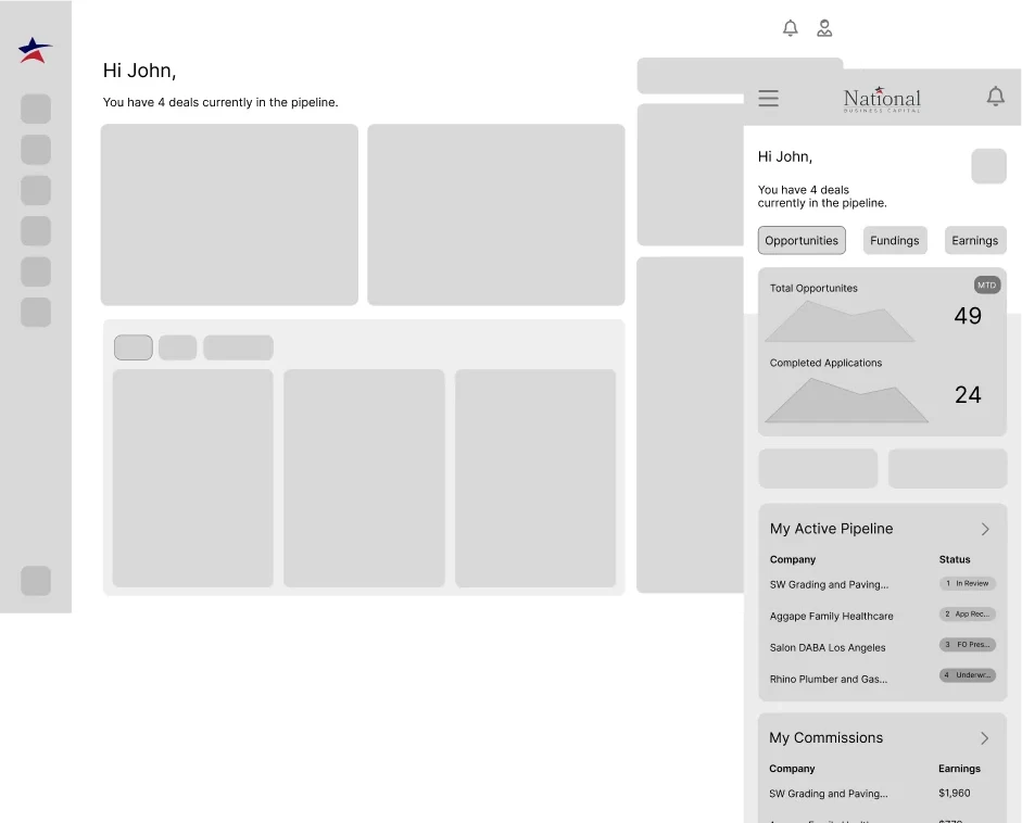
I organised the portal around what partners come to do and wireframed it for mobile first, setting each existing screen beside its replacement to compare them.
National Business Capital · Product design · Web + mobile · Financial workflows
In brief
I redesigned three products for National Business Capital. One is the portal its partners use to track their deals. The other two are the steps a client takes to get funded: reviewing an offer and then submitting documents.
How a deal works
National Business Capital helps small and mid-sized businesses get funding. Some business owners come to it directly. Others are referred by partners, who earn a commission when a deal funds. An advisor presents the funding offers and guides the client through them. The client signs, sends the documents the deal needs, and the deal funds.
01 · 2025
Enough visibility to trust the process.
Partners are the people and firms who bring deals to National. They use the portal mostly to submit new opportunities, then to track those deals and the commission they earn. Brokers, consultants and affiliates are the most active on the portal: they send the most deals and come back to track their pipeline and their commission. Investment bankers, private equity and M&A firms send fewer, larger deals, usually using National for junior or bridge capital.
“My name is on this deal — I need to know what’s going on every step of the way.”
Partner · from interviews
“I just want to see where my lead is and when I’m getting paid.”
Affiliate · from interviews
Before and after
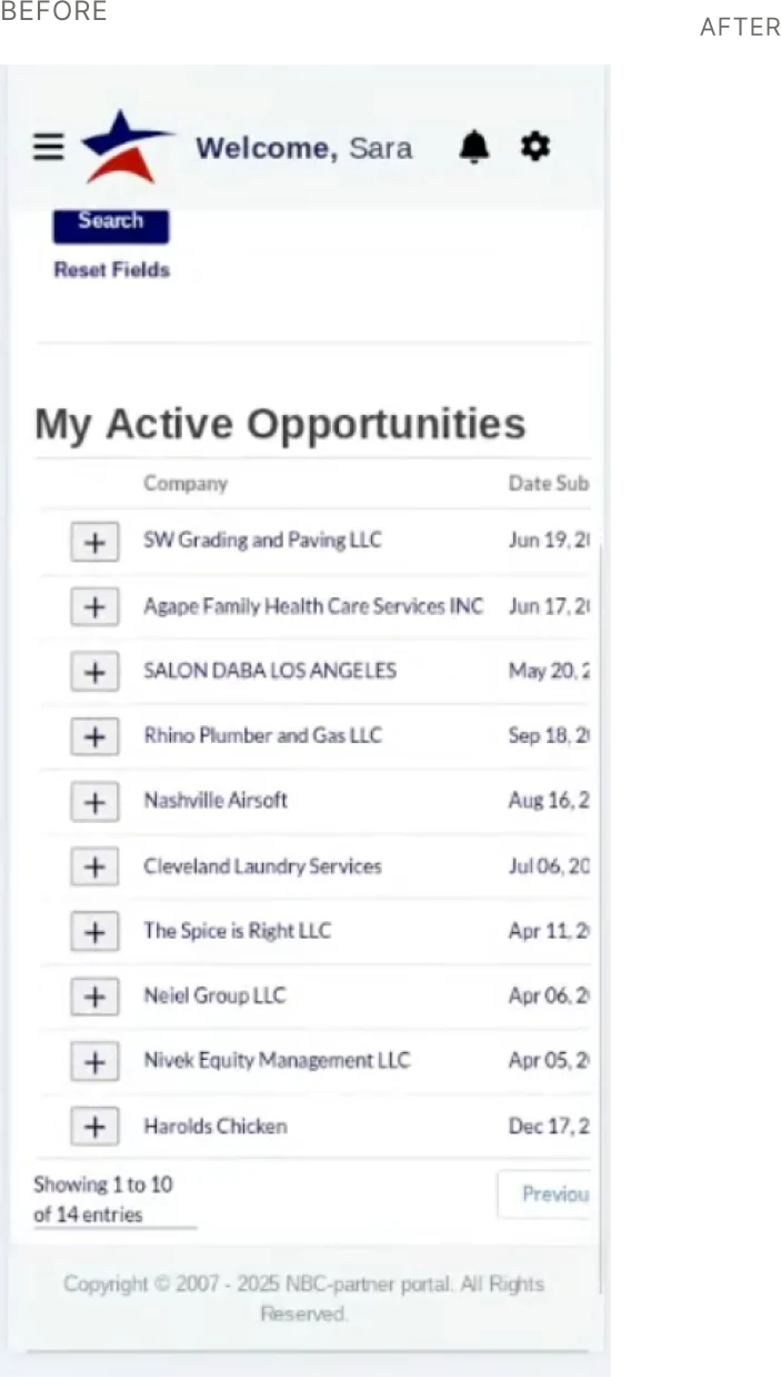
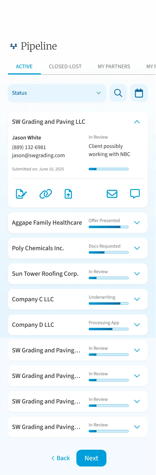
From an outdated portal to a pipeline partners can follow.
Study
I audited every screen of the existing portal. With a research partner, I interviewed partners and internal stakeholders, and we ran a usage survey.

Study
We grouped what we heard into themes: notifications, transparency, support, mobile, resources and security. Most were requests we could build: real-time status alerts, a legend for the pipeline stages, chat tied to each deal.
One was a conflict. Partners wanted to see the dollar amounts behind their deals. National does not share a deal’s terms or its rates with partners. The portal had to give partners enough to trust the process without showing those numbers.
From partner interviewsPartners want to see the dollar amount on a deal and cannot get it from the portal. They read that as a lack of transparency.
From stakeholder interviewsThe business is hesitant to give partners too much detail, and wants to be able to keep it concealed.
What it came down toA tension between transparency and control.
The portal had to earn trust without showing the terms.
Make
The survey showed that submitting new opportunities was the most-used feature, real-time status was the most requested, and email was the preferred way to be alerted. I ranked each problem by how often it came up, then agreed with leadership what would go into the first release and what would wait for a second phase.
Make
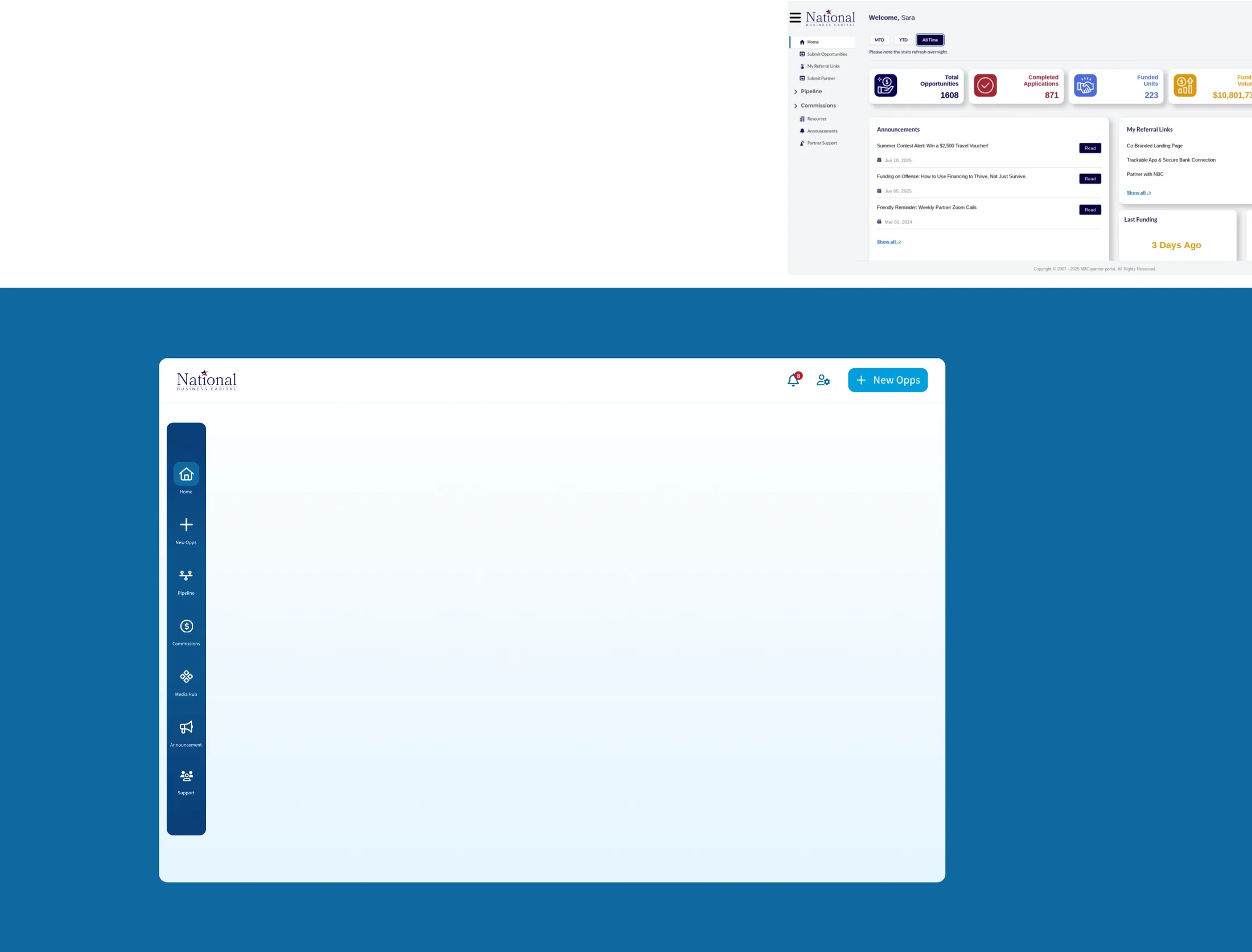
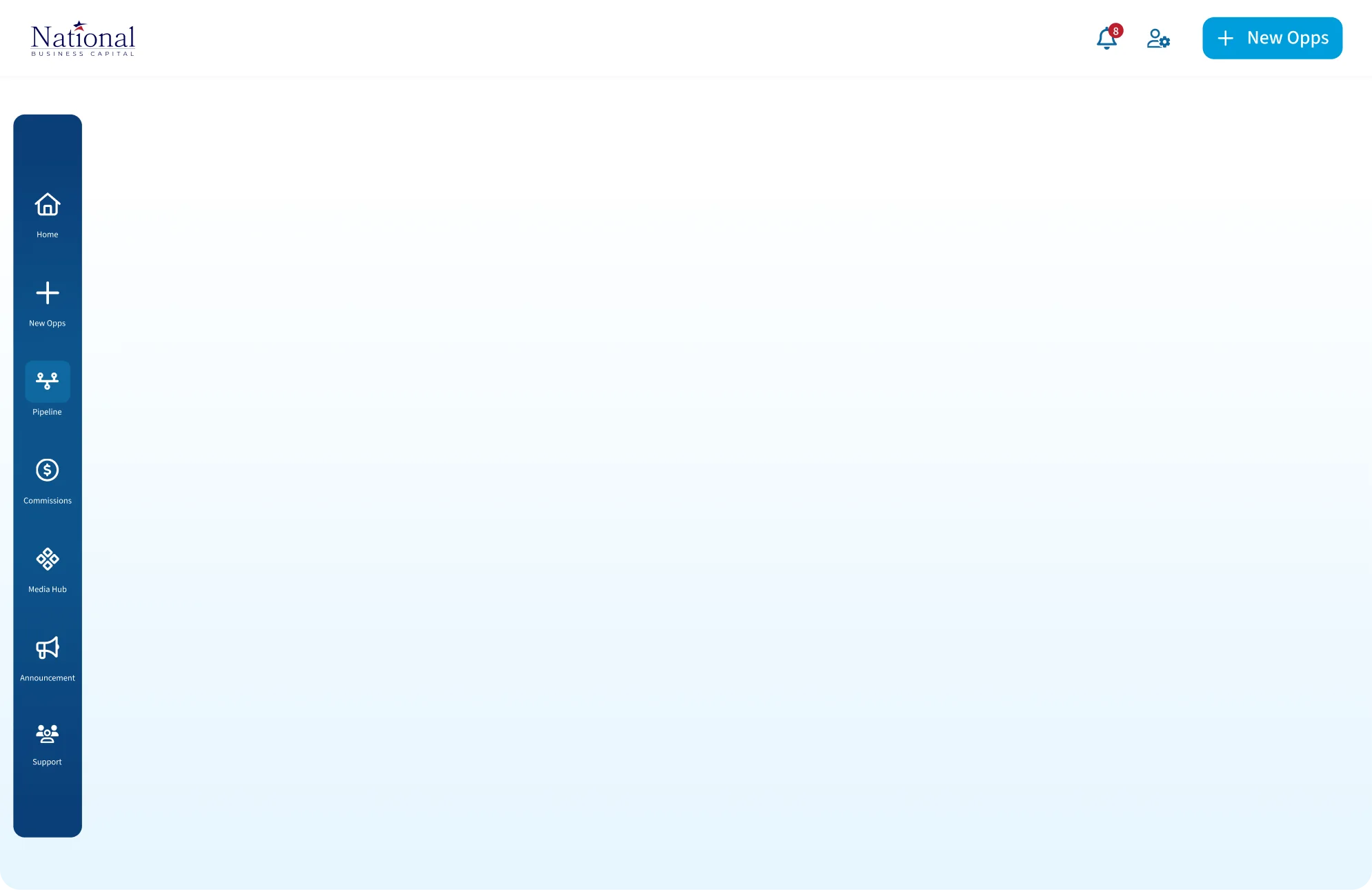
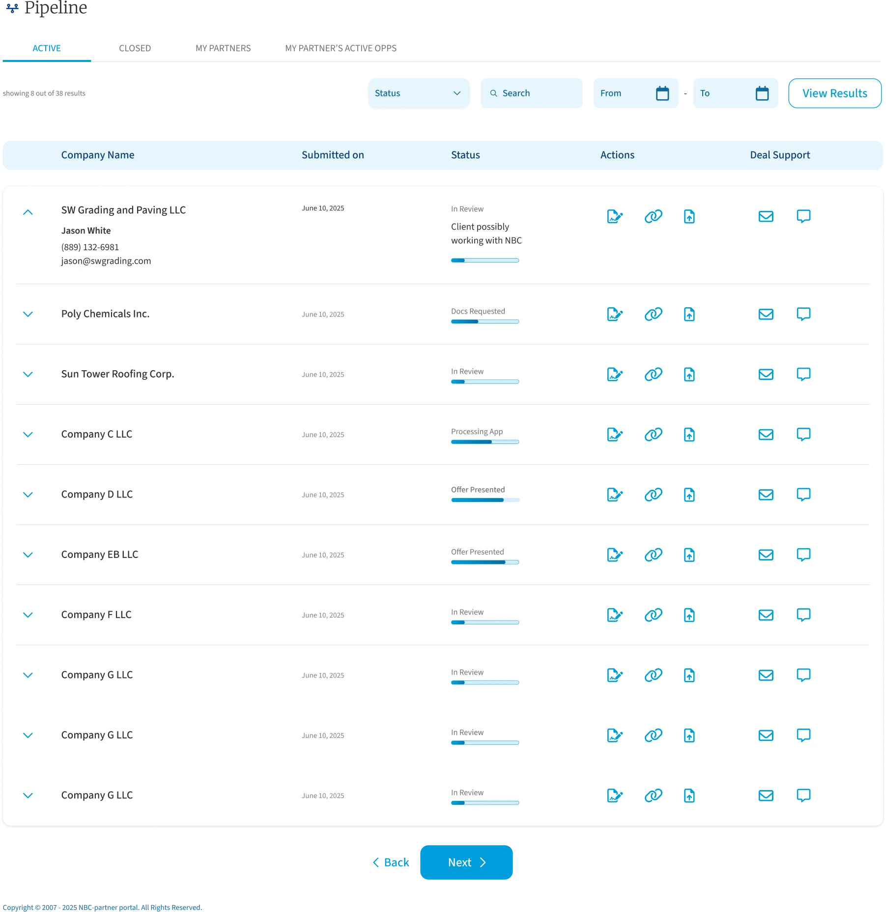
I organised the portal around what partners come to do and wireframed it for mobile first, setting each existing screen beside its replacement to compare them.
Decide
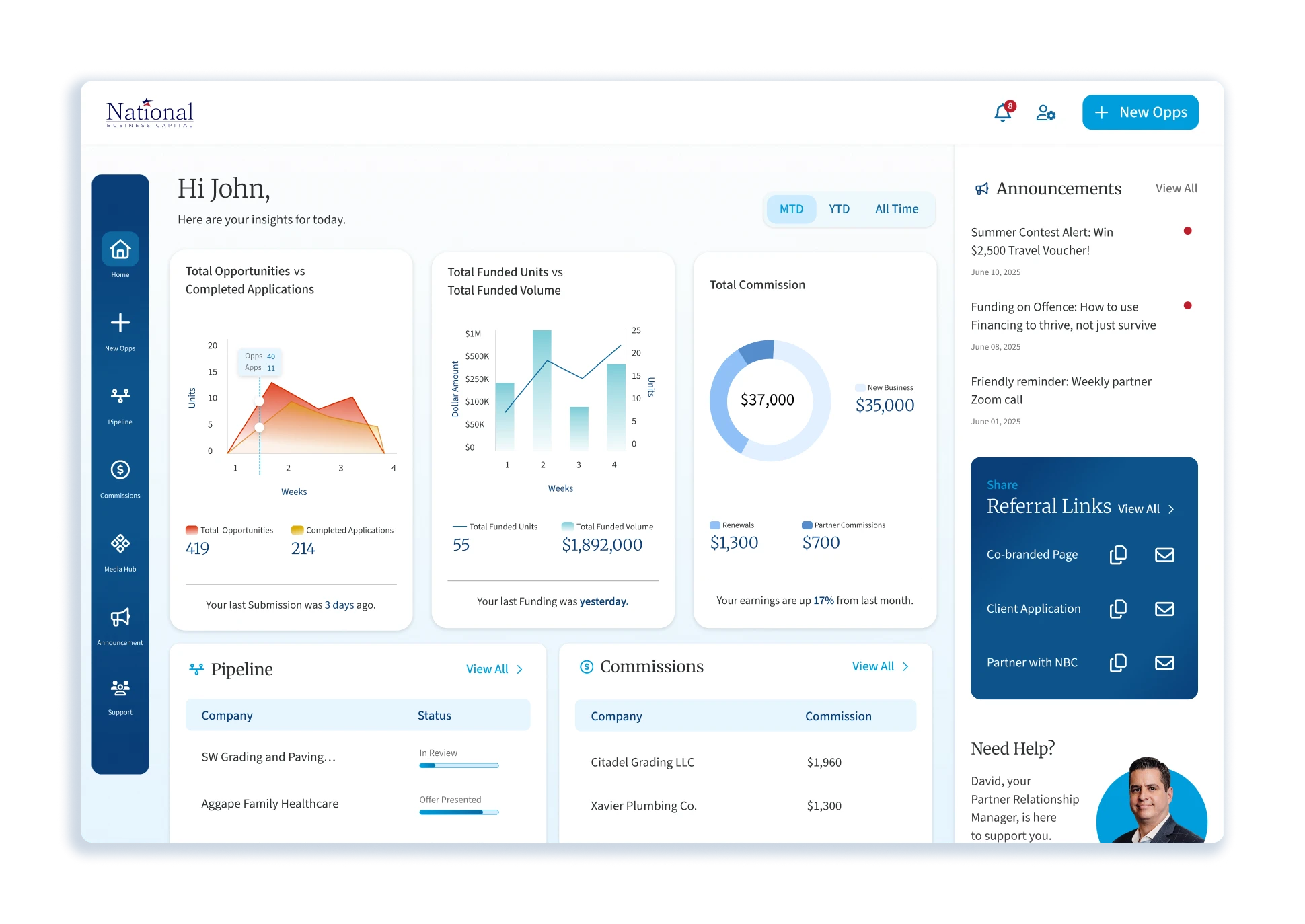
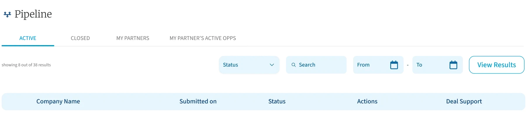
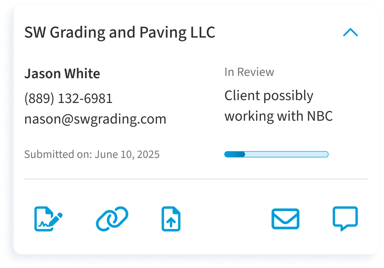
Each deal moves through six stages, named in plain language. A partner can see which stage a deal is in, whether it funded, and the commission they earned. The deal’s terms and National’s rates stay out of view. The old portal gave no reason when a deal was closed-lost. Now it always does, so a partner is never left wondering why a deal fell through, and they can chat with someone to find out more.
Decide
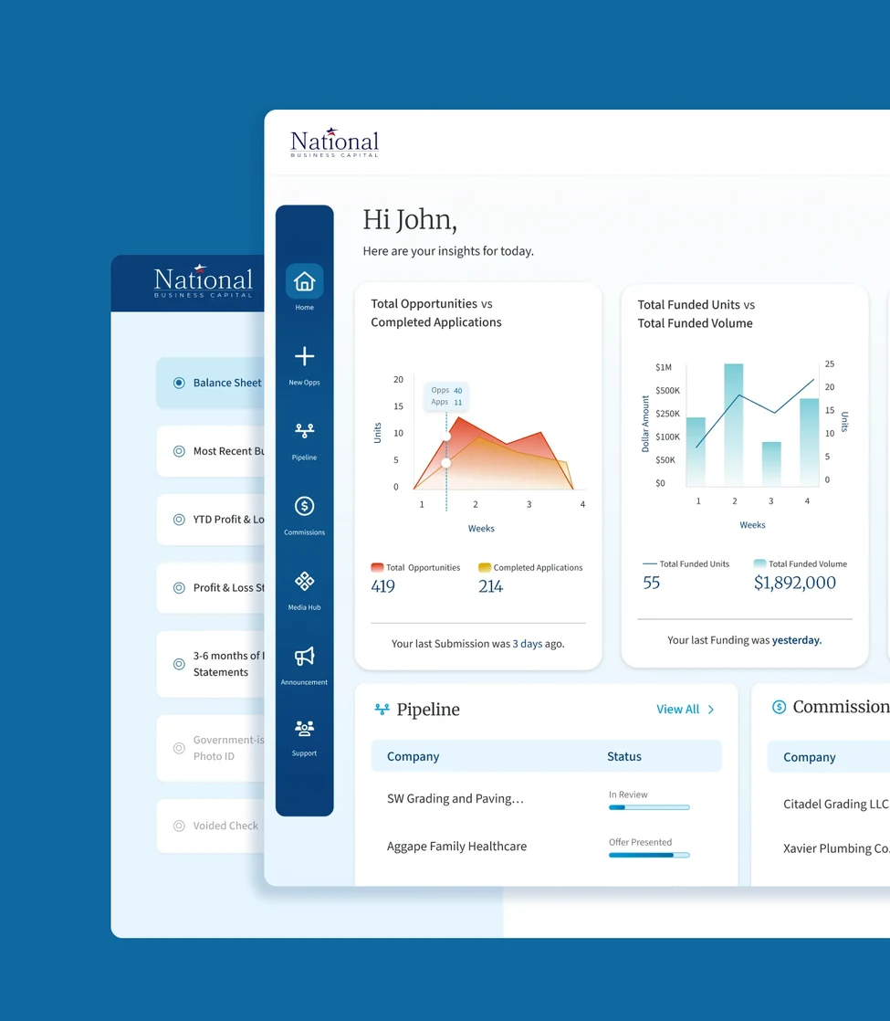
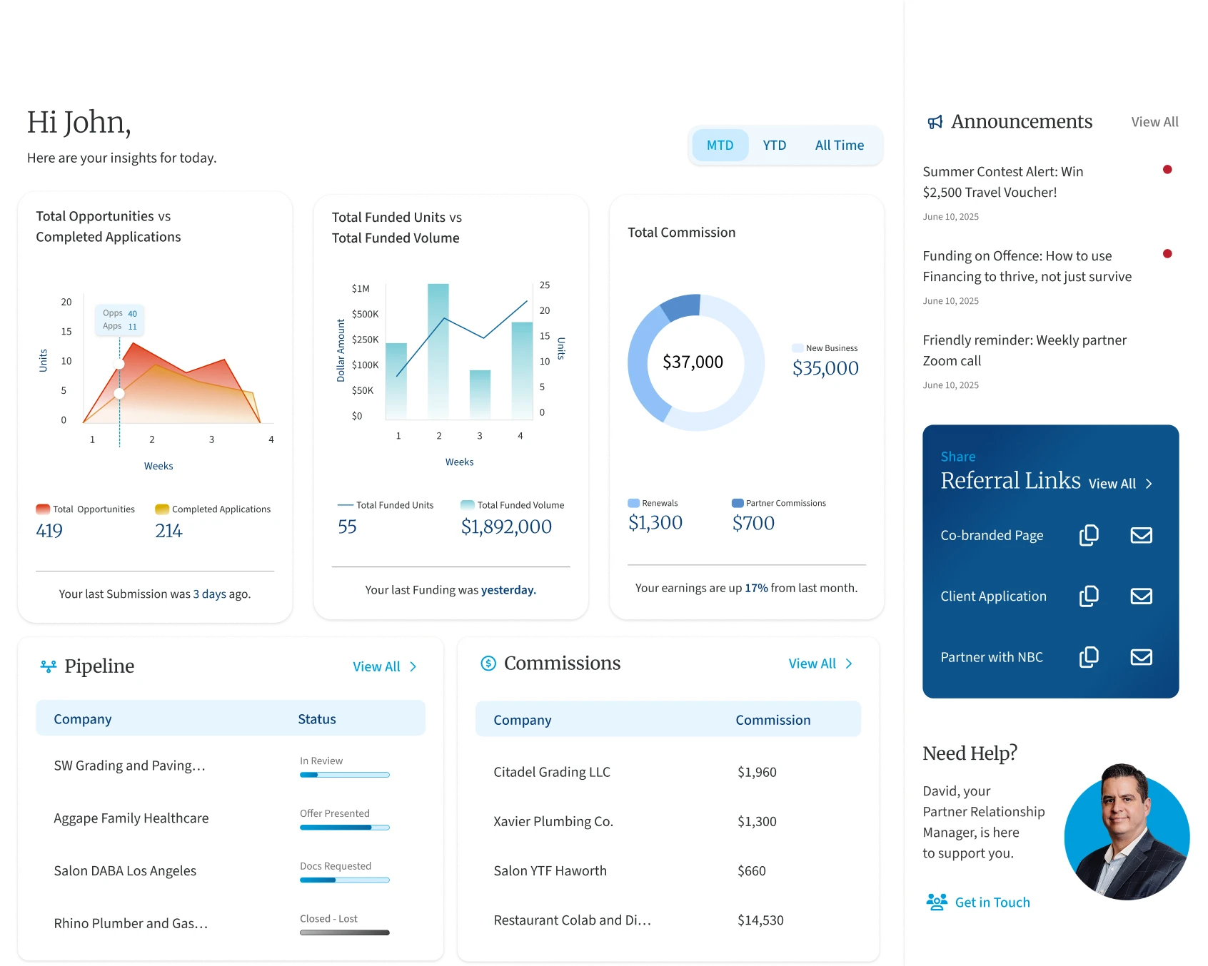
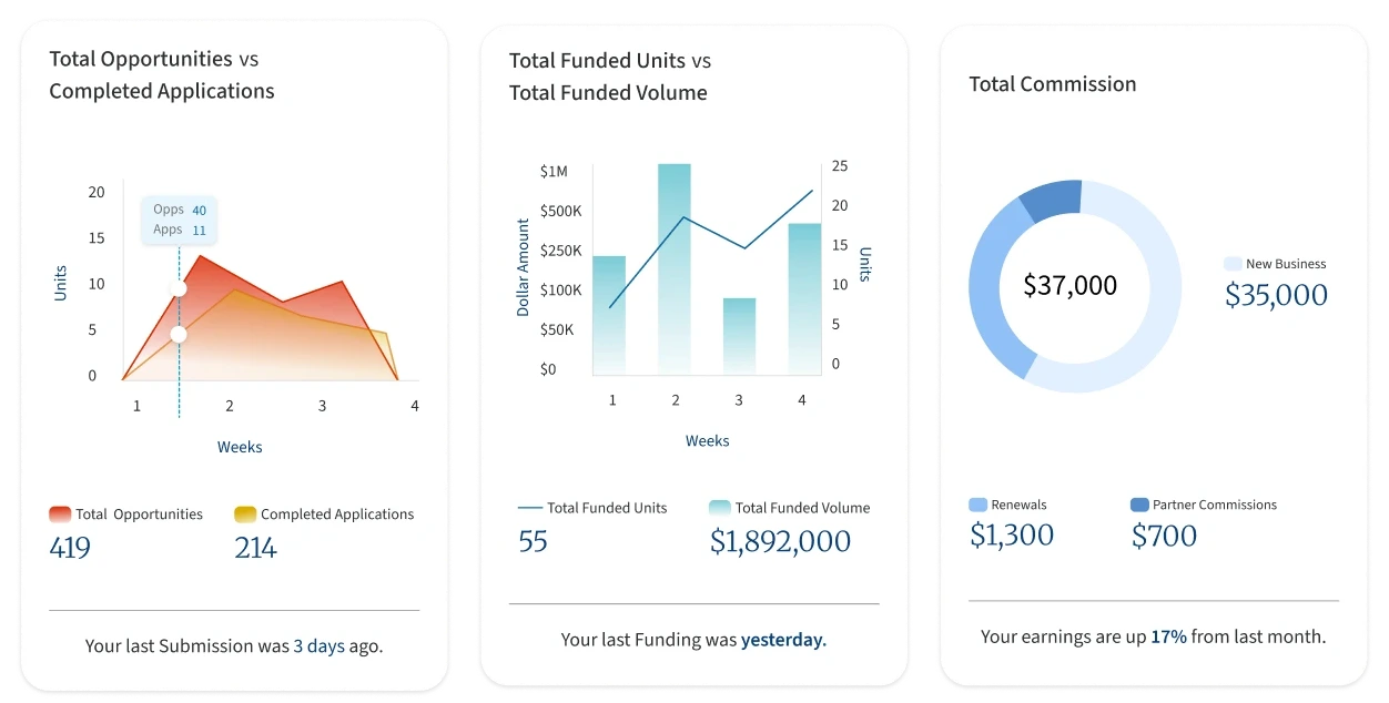
The old dashboard listed totals. A partner could see how many opportunities they had sent, but not how many became applications or what their funded deals were worth. The redesign pairs the same data to answer that, and a prompt showing the days since their last submission nudges them to send the next one.
Decide
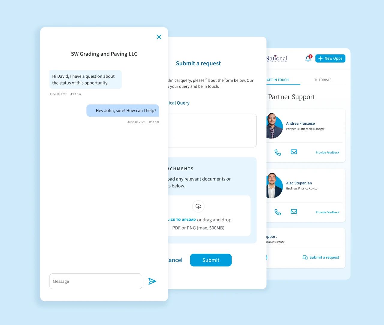
Chat was one of partners’ top requests. In the old portal, a message felt like a note left on a file, and the reply came back as an email. I proposed a chat feature inside the portal, tied to each deal, with an automatic reply when the advisor is unavailable. The chat launched with the new portal. Confirmations and compliance details across the portal made it easier to trust.
Outcome
The new portal replaced the old one, and partners valued the whole redesign.
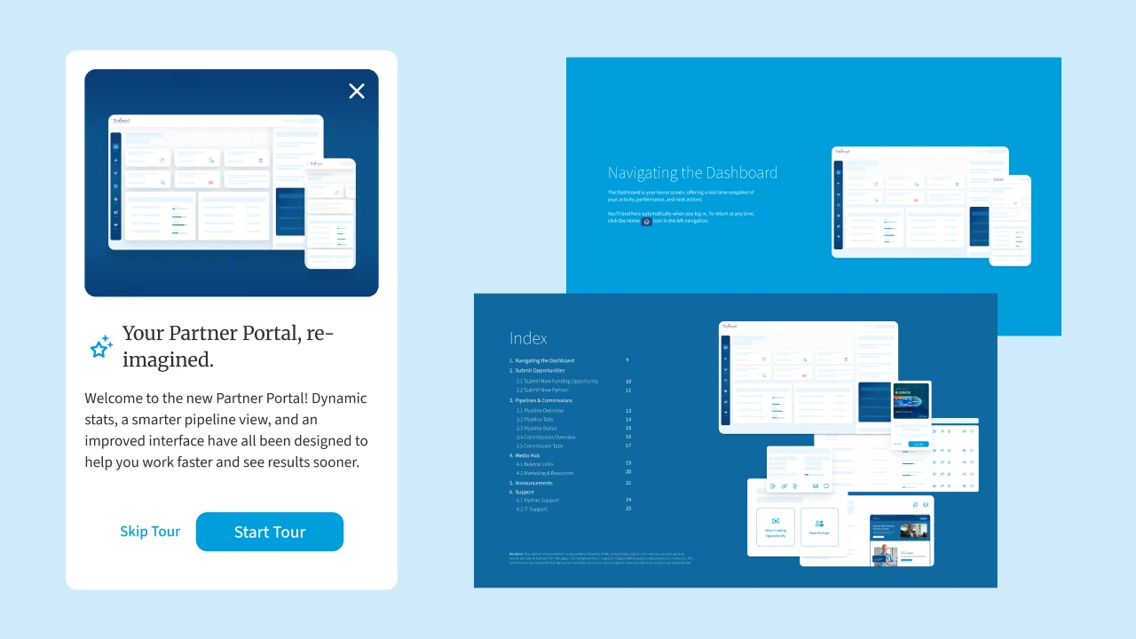
Partners and leadership responded well to the layout and the experience as a whole, and partners singled out the chat they had asked for. In finance, that matters: a partner sending a client to National has to trust where the deal is going, and a clearer, more transparent portal builds that trust. The first release launched with onboarding and a guide that explains each stage. Notifications, the most complex request, were designed and built in a second phase, with email or text alerts for each stage.
Carried forward →
That was the partner’s side of a deal. On the client’s side, offers still arrived as a PDF and documents went back by email.
02 · 2025 – 2026
From an emailed PDF to funding.
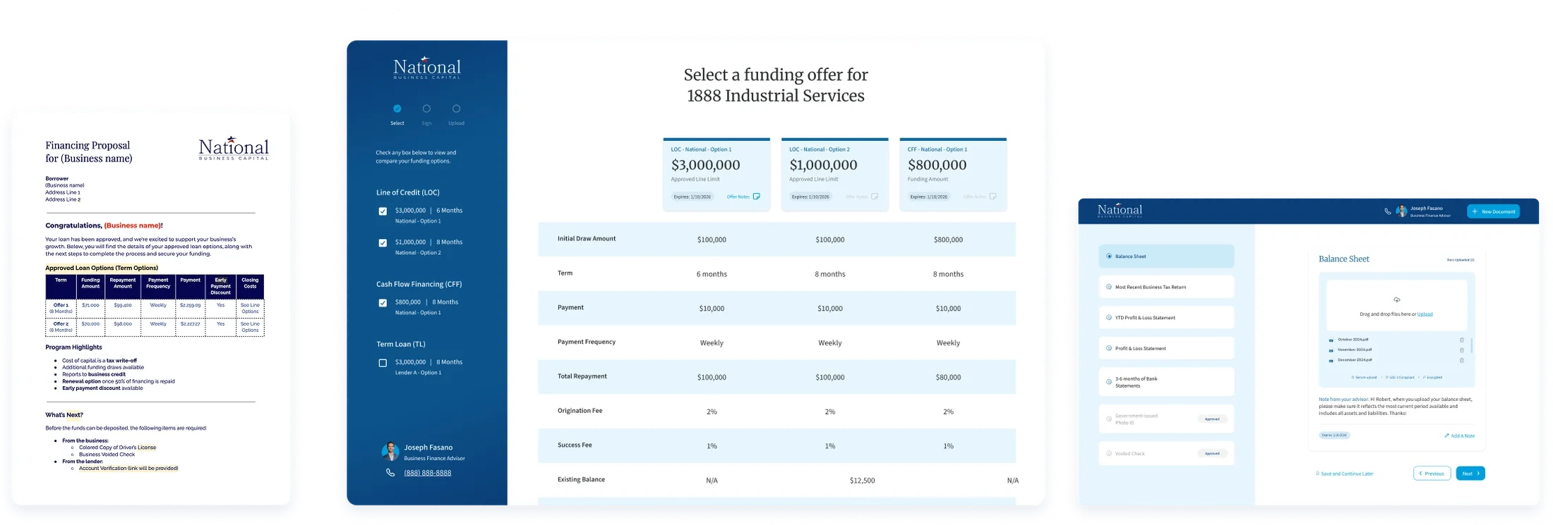
Funding offers used to be emailed as a PDF that ran to several pages. Every offer was in it, but the information was cramped and hard to read, and the client worked through it alone, with no easy way to compare one offer with another.
Before and after
From a PDF and an email thread to offers compared on screen and a checklist for documents.
Make
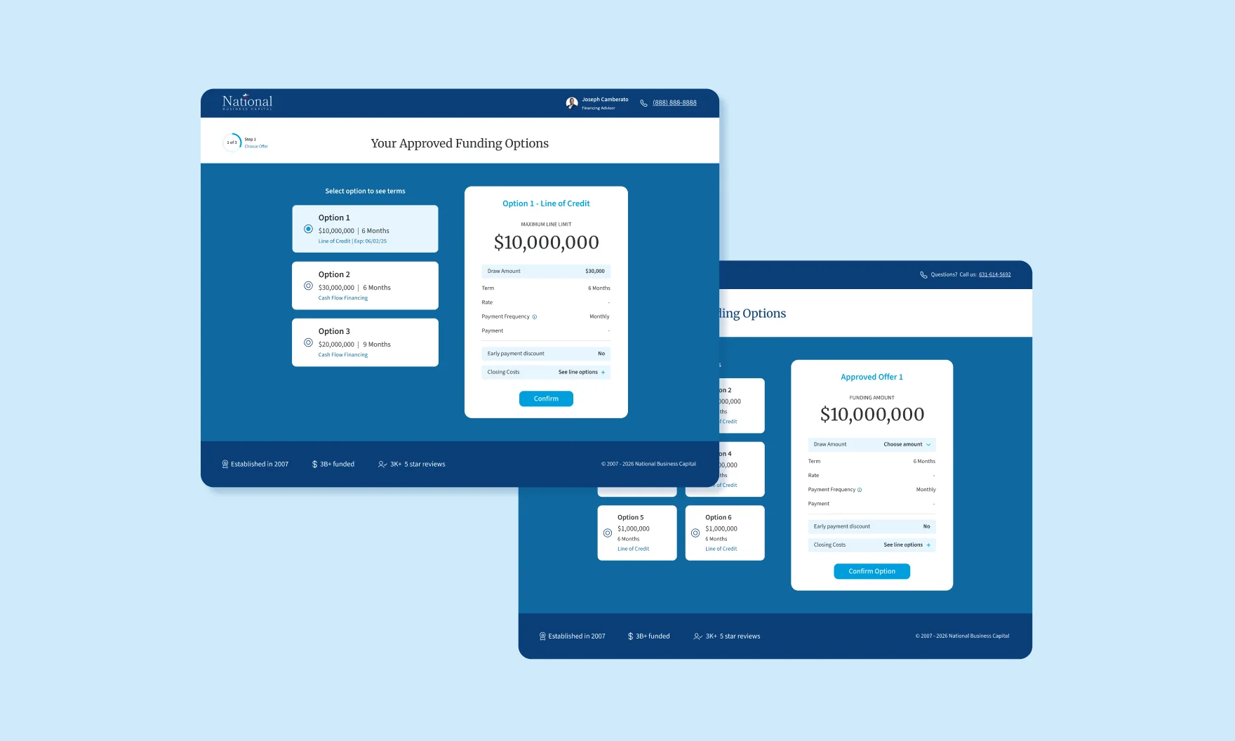
I audited the PDF process and looked at how consumer brands let people compare plans. The first release turned the PDF into three steps: choose an offer, sign, upload documents. It showed one offer at a time.
Each offer is pulled from the deal record in Salesforce, so I worked closely with the Salesforce and front-end developers on which fields appear, how the screens behave and how they perform.
Decide
One offer at a time made each offer easy to read, but hard to weigh against the others.
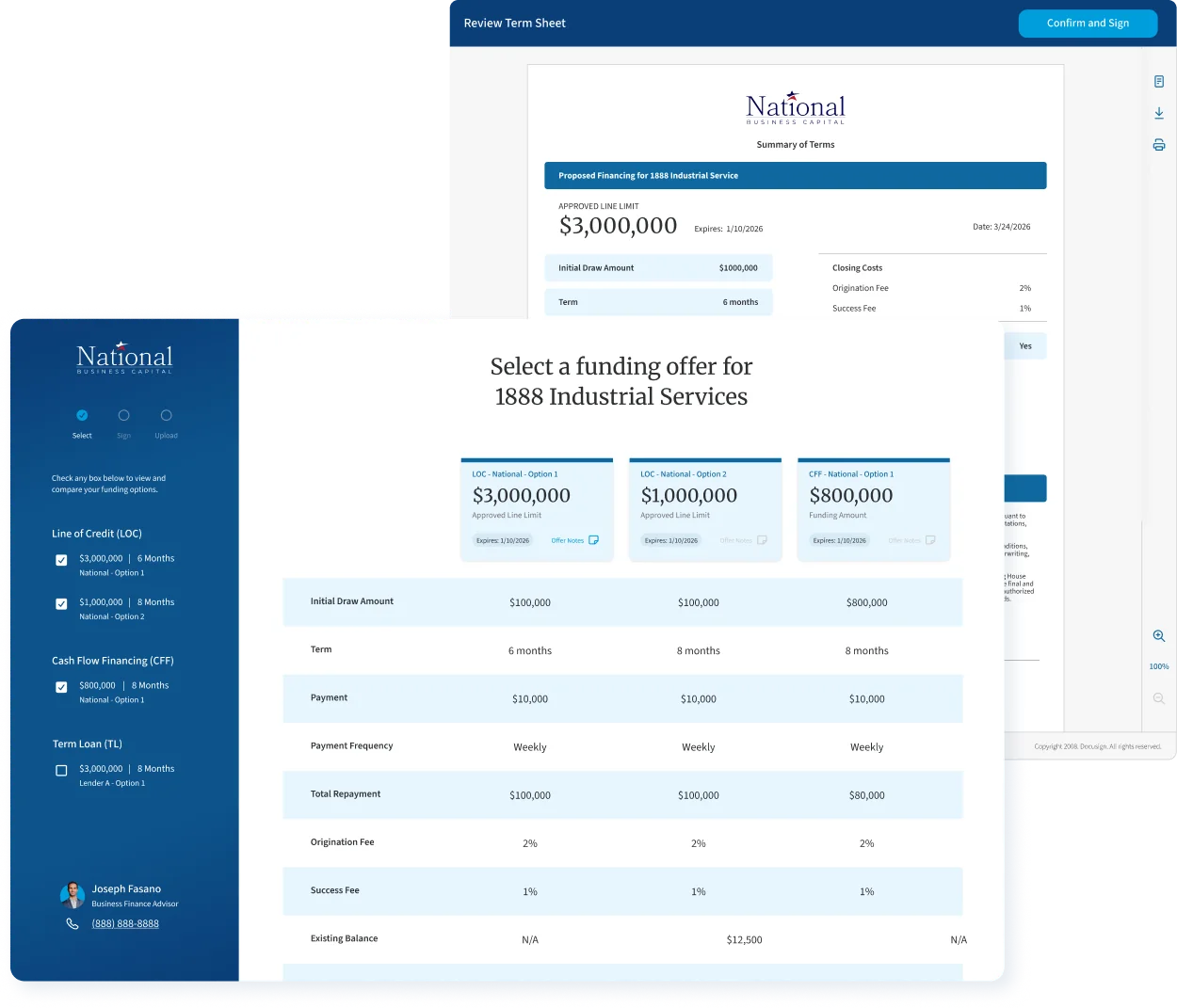
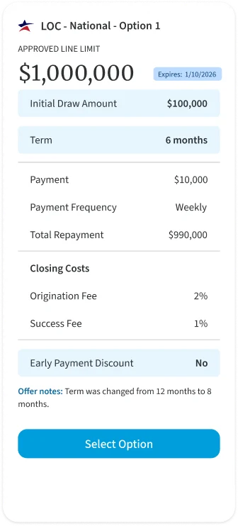
After conversations with the business about how offers are actually discussed, we chose a comparative layout: every offer side by side, visible to the advisor and the client on a call, from a link the advisor sends.
The client selects one, reviews its term sheet on the next screen, where DocuSign is embedded in the product, and signs there.
Make
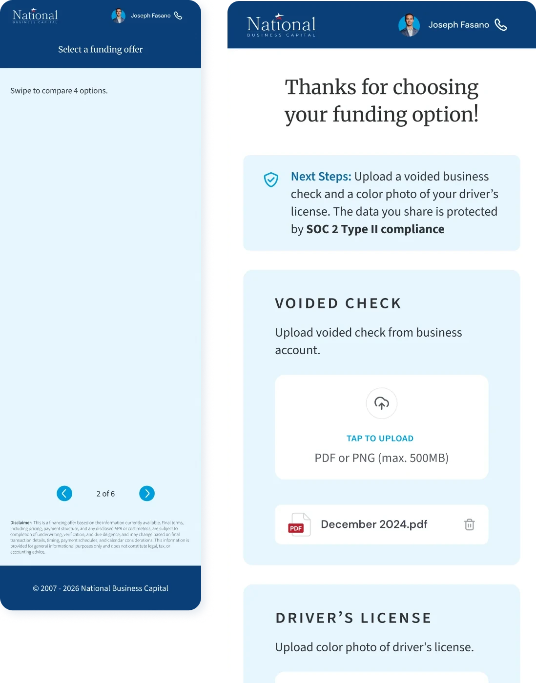
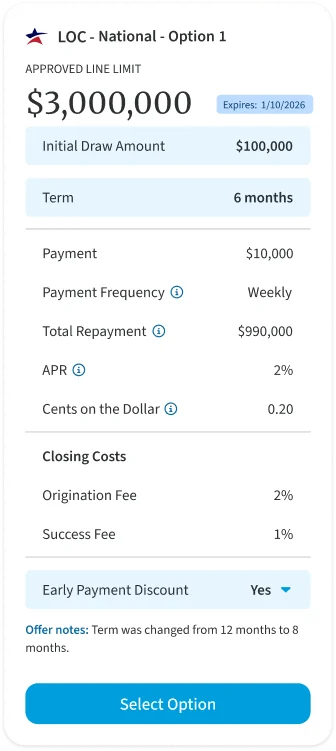
The client swipes between offers and signs from the same screen.
Outcome
A client can go from comparing offers to a signed term sheet in one flow, with an advisor on the call and no email back-and-forth.
Carried forward →
Once an offer is signed, the client still has documents to send. That step became a product of its own.
Study
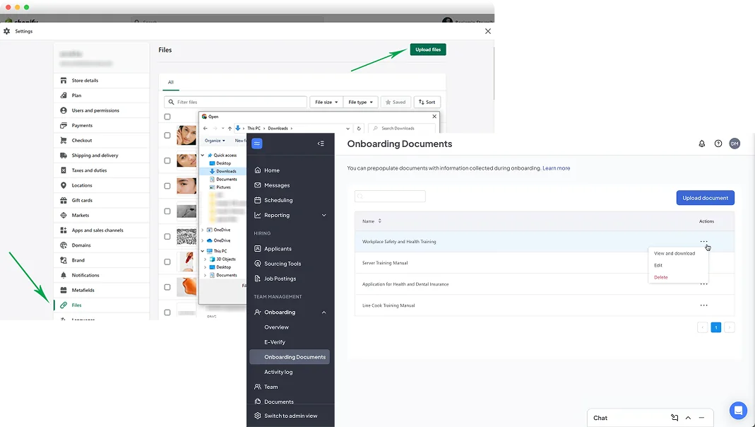
National emailed the client a list of required documents, and the client sent them back as attachments, a few at a time. Advisors followed up by email, and clients had to guess what was still missing. Before designing, I studied how other products show progress through a long set-up, from payroll onboarding to commerce platforms.
Make
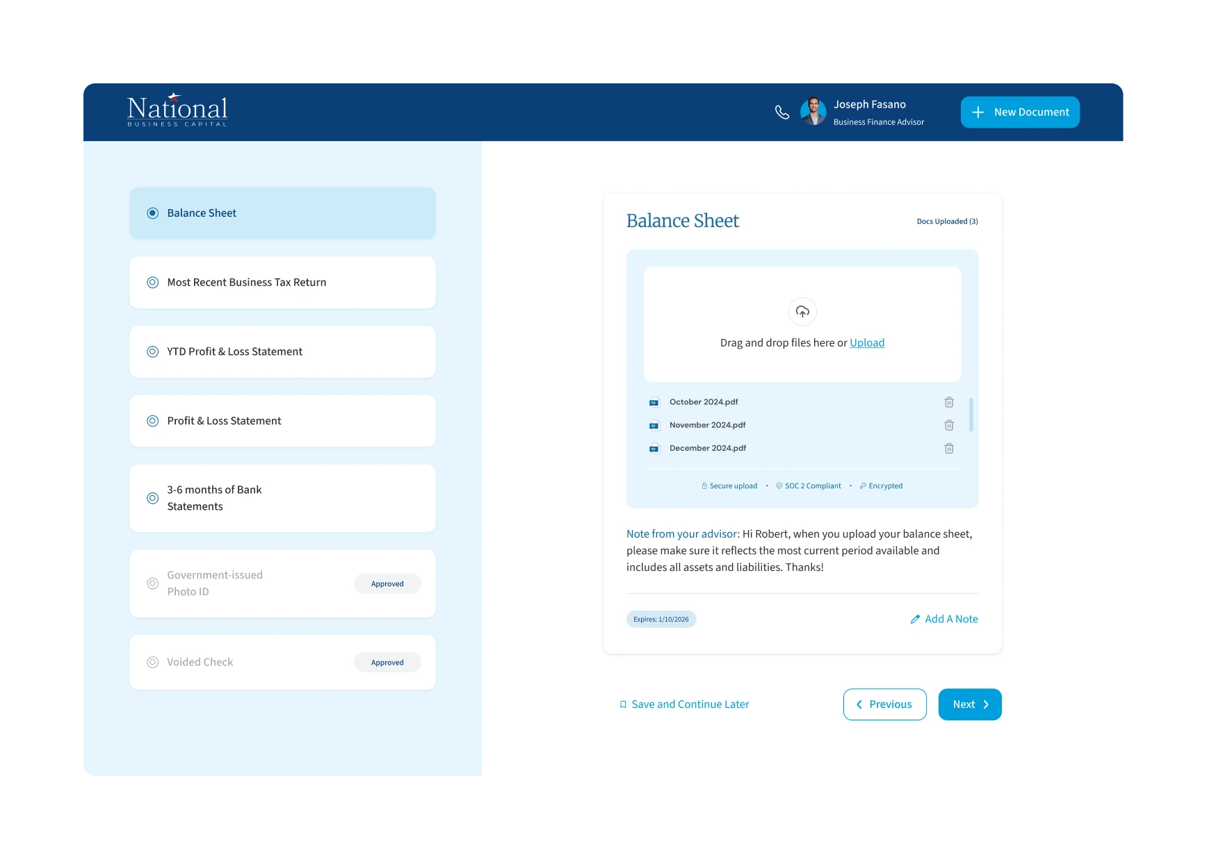
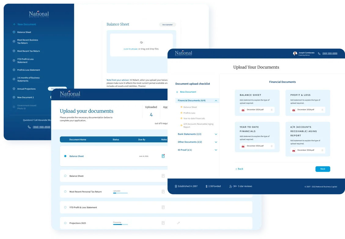
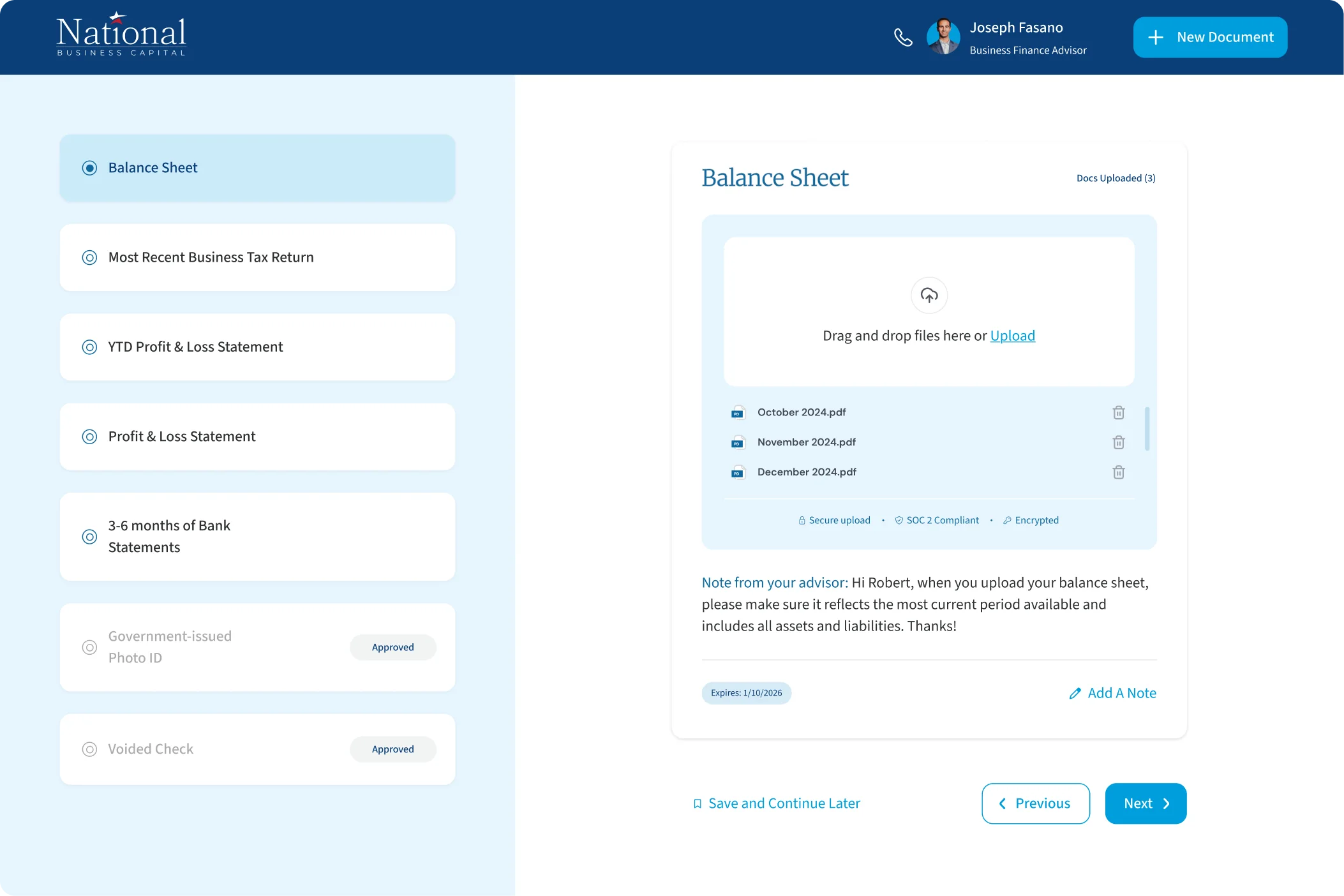
The brief was to take the document screen the team used in Salesforce as the wireframe and restyle it in the new brand. That screen worked well for staff. For a client handing over bank statements and tax returns, it did not: nothing explained what was needed, what had been received, or what would happen next. The Creative Director and I went back to that research and proposed a guided checklist that takes one document at a time. We presented it with our reasoning, and leadership approved it.
Decide
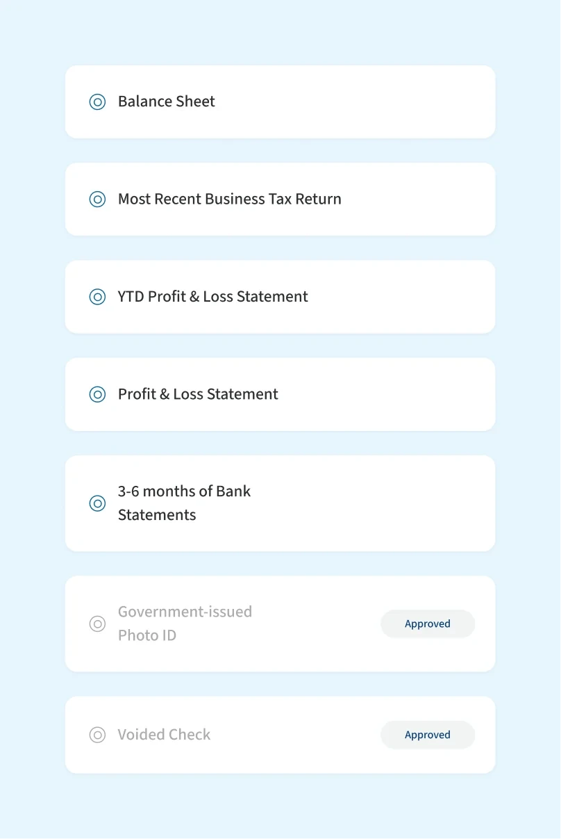
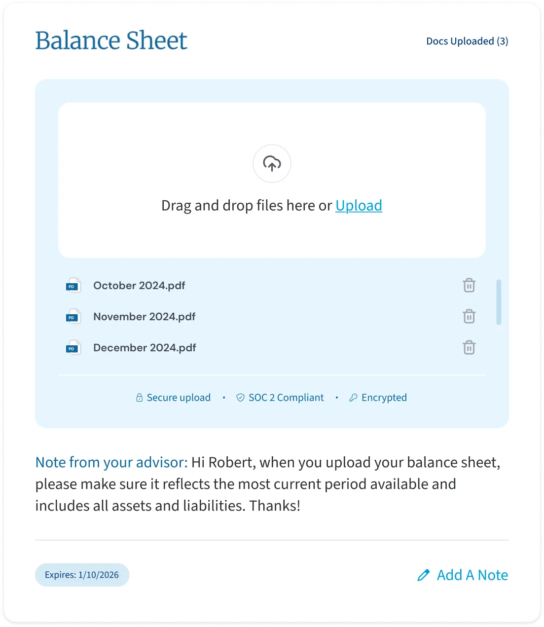
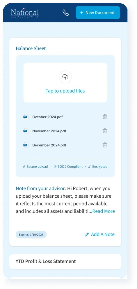
The checklist sits beside the upload area, on desktop and on mobile. Each document shows its status: pending, under review, approved or rejected, and then in underwriting. If a document is rejected, the advisor’s reason comes with it, and the client can reply with a note. Nothing has to be finished in one sitting. The client uploads what they have, the link stays active, and they can come back for the rest. If a document needs another look, an email tells them.
Decide
In the first build, a file could not be removed once it was uploaded. I asked what a client would do after uploading the wrong one, and proposed a fix to the Salesforce developer and the product manager. After a few rounds of discussion, clients can now delete a file until they press Complete.
Outcome
Collecting documents by email was replaced by a guided checklist.
Summary
All three products launched. I was responsible for UX and UI on each, and for the portal research alongside a research partner. I designed every state and handed over developer-ready specifications, then checked the build through release, working with the Creative Director, product and engineering.
Accessibility
Designed to WCAG AA.
Every colour pair checked for contrast, every field labelled, touch targets sized for a phone and a set focus order, all written into the specifications engineering built from.