Make
From brand to rules.
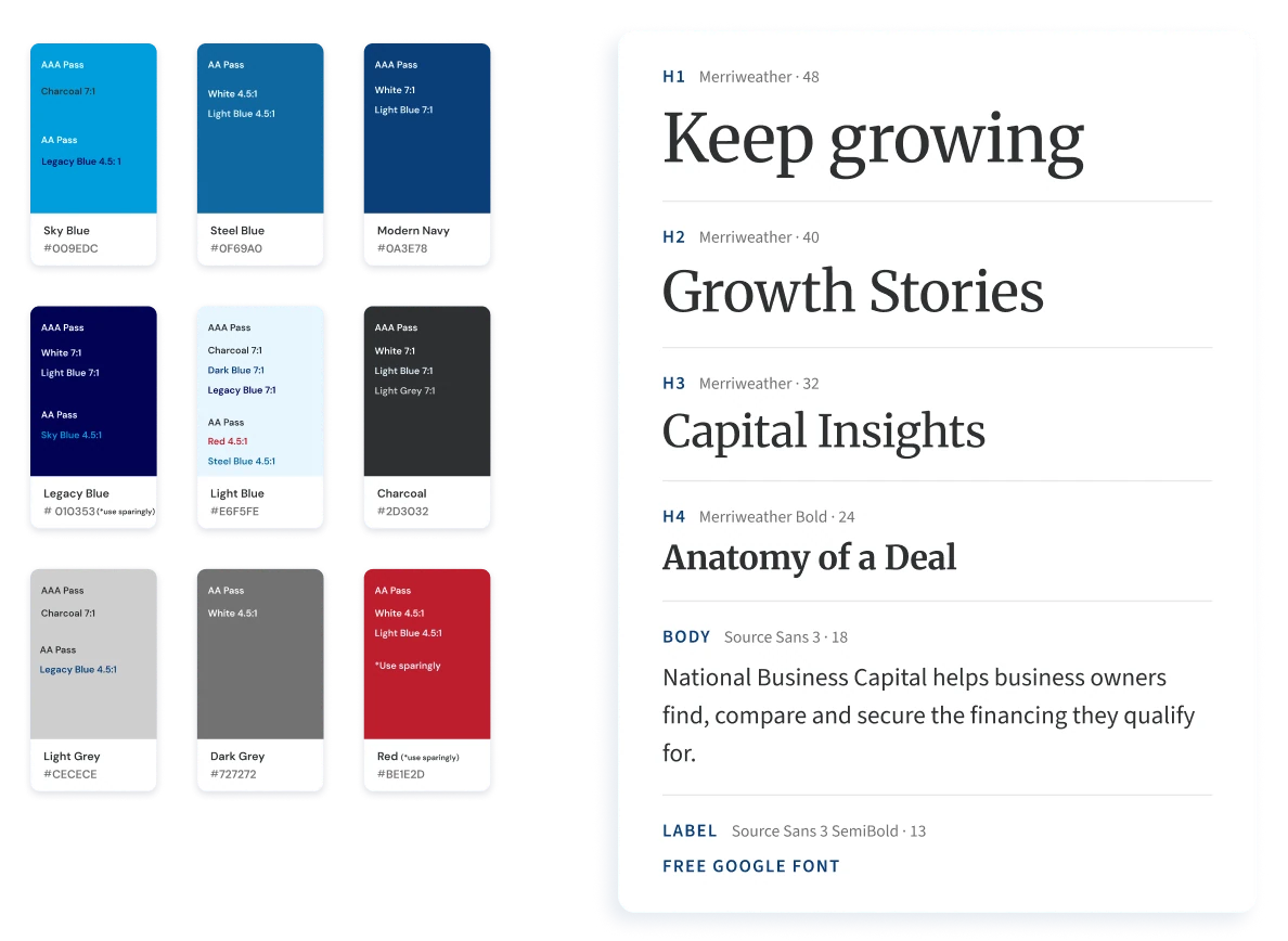
When National rebranded, I was brought on to design the website. I started with its system: rules for type, colour and spacing, with every colour pair checked for contrast against WCAG AA.
National Business Capital · Experience design · Web · Digital systems
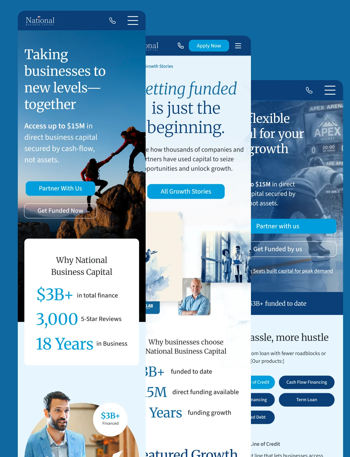
In brief
National Business Capital funds businesses so they can grow. After its rebrand, I designed its website, the three hubs built on it, and a second version shaped by how people used the first.
01 · 2025
One system, built to grow.
Make
When National rebranded, I was brought on to design the website. I started with its system: rules for type, colour and spacing, with every colour pair checked for contrast against WCAG AA.
Make
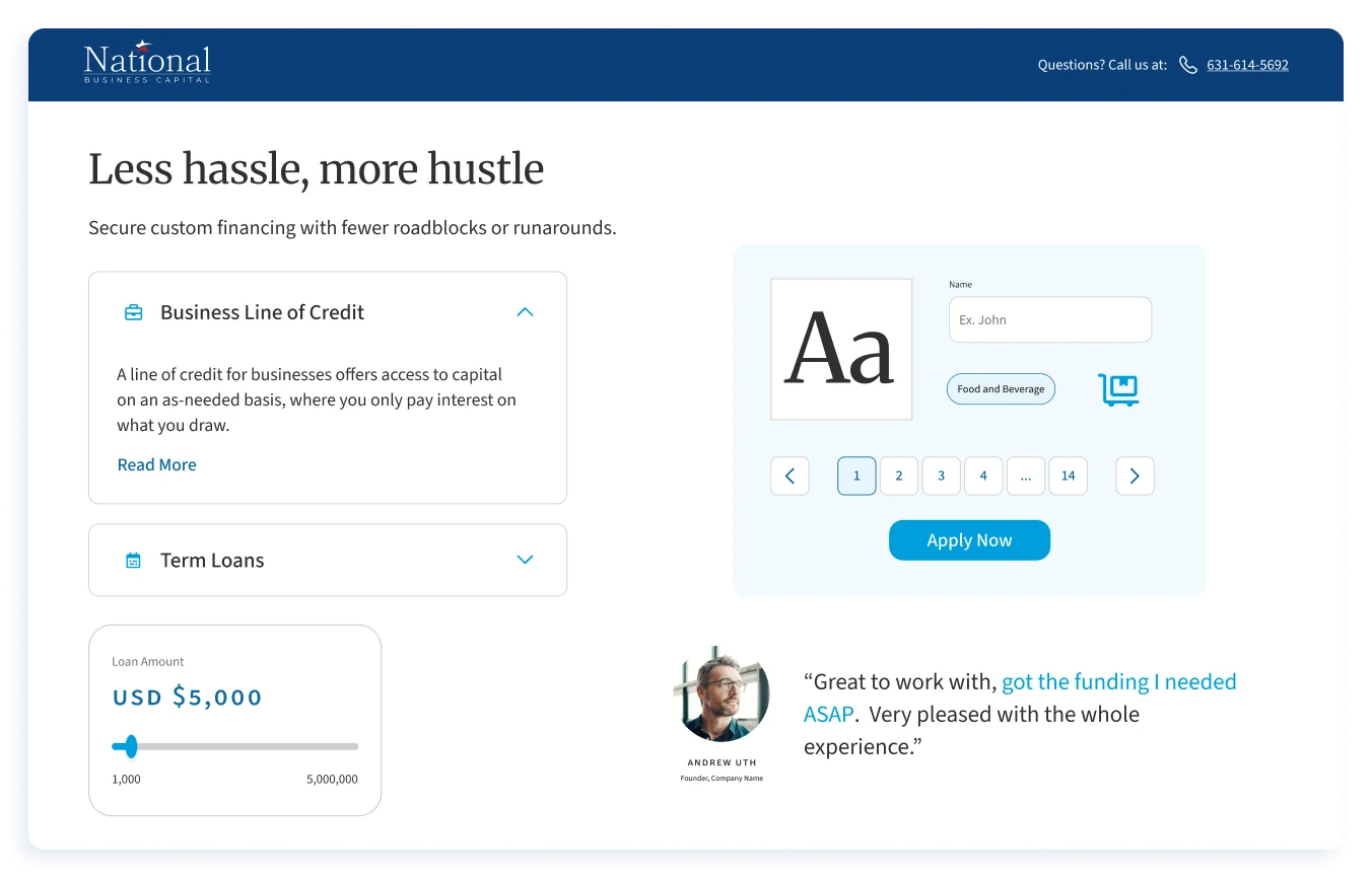
The rules became a pattern library: buttons, form fields, cards and modules, each defined in every state and on every background they would sit on.
Make
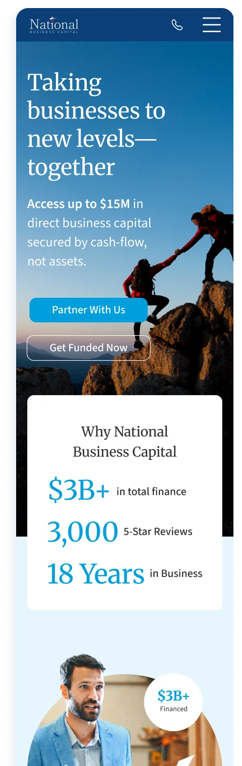
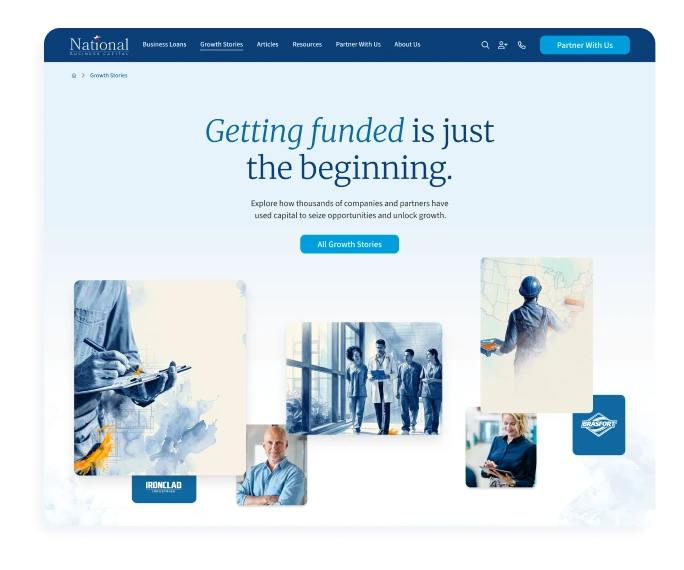
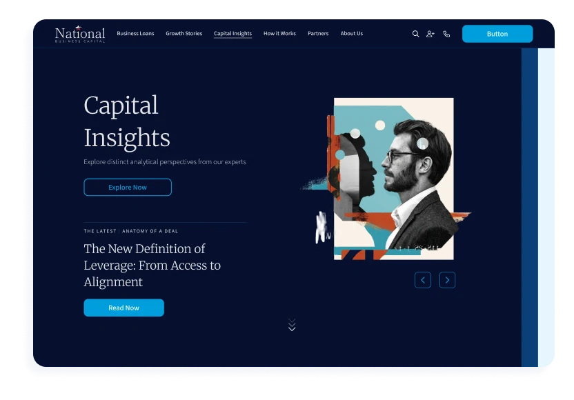
The homepage explained how deals work in three steps. Partners and clients needed room to find their own answers, so I designed three hubs on the same system: the Partner Hub, Growth Stories and Capital Insights. I owned each from research to the handoff to engineering.
Outcome
The website launched in 2025 and won a WebAward Standard of Excellence. Every hub after it was built from the same parts.
02 · Late 2025 – 2026
Different questions, one next step.
Study
A broker sending small, recurring deals wants to know how the process works and what they’ll earn. An investment banker bringing a larger company wants to know, fast, whether National can do the deal.
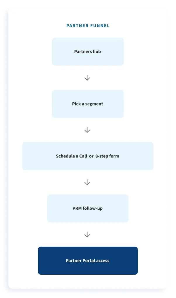
One hub had to answer both, then move each partner to the same next steps: a call or the application, a relationship manager’s follow-up, and access to the Partner Portal.
Decide
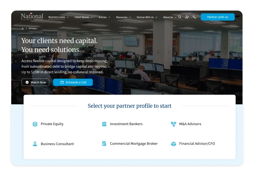
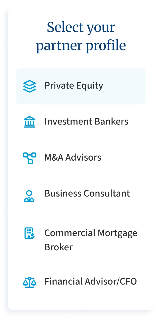
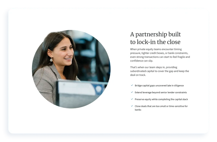
From the first version, partners choose who they are. I reused the loan-type card module as a profile picker for four groups, and each opens a page built from the same modules in a different order. Brokers start with why National and when a referral helps. Bankers start with the deal gaps National closes, then how to qualify, with a call in the banner.
The broker and advisor page ranked in the site’s top five for scheduled calls and partner applications.
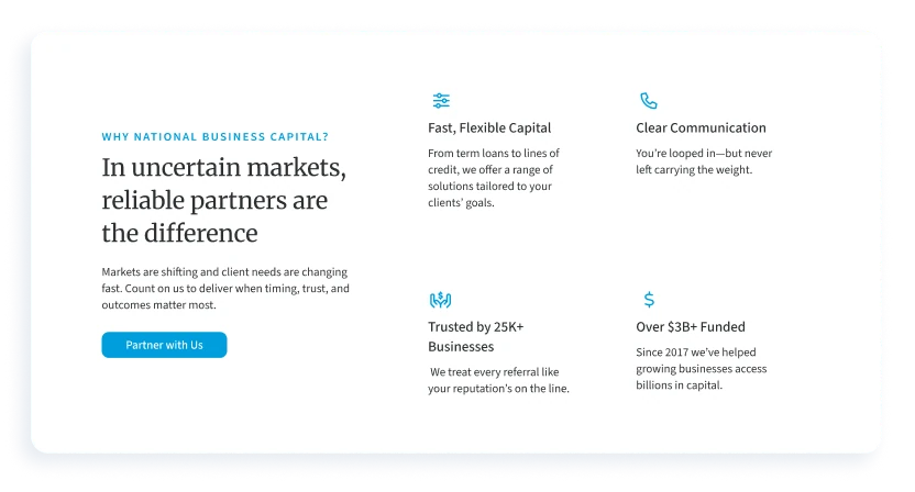
Before
Met a counter that said three steps, then eight screens before they could submit.
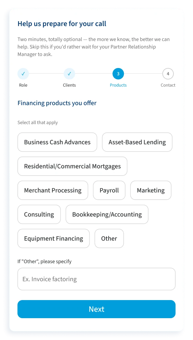
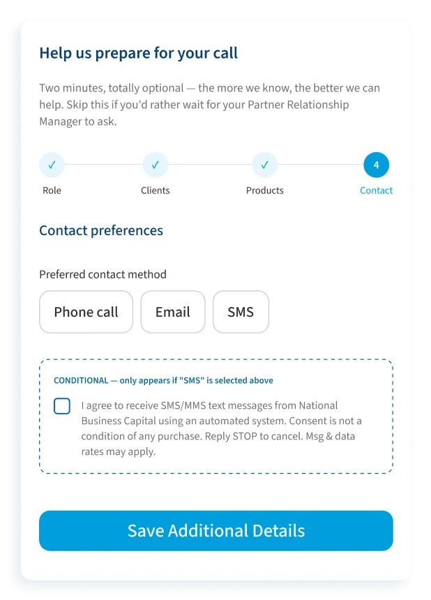
Needed partners in its system first, then enough detail to prepare each first call.
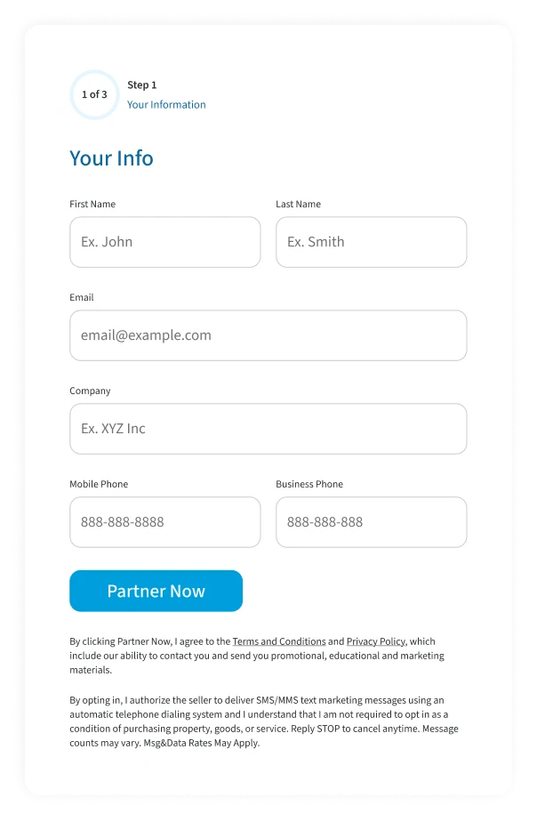
After
Step one now asks only what’s needed to submit and start a conversation. Once a partner has applied, four optional questions on their role, clients, products and contact preferences help the relationship manager prepare for the first call.
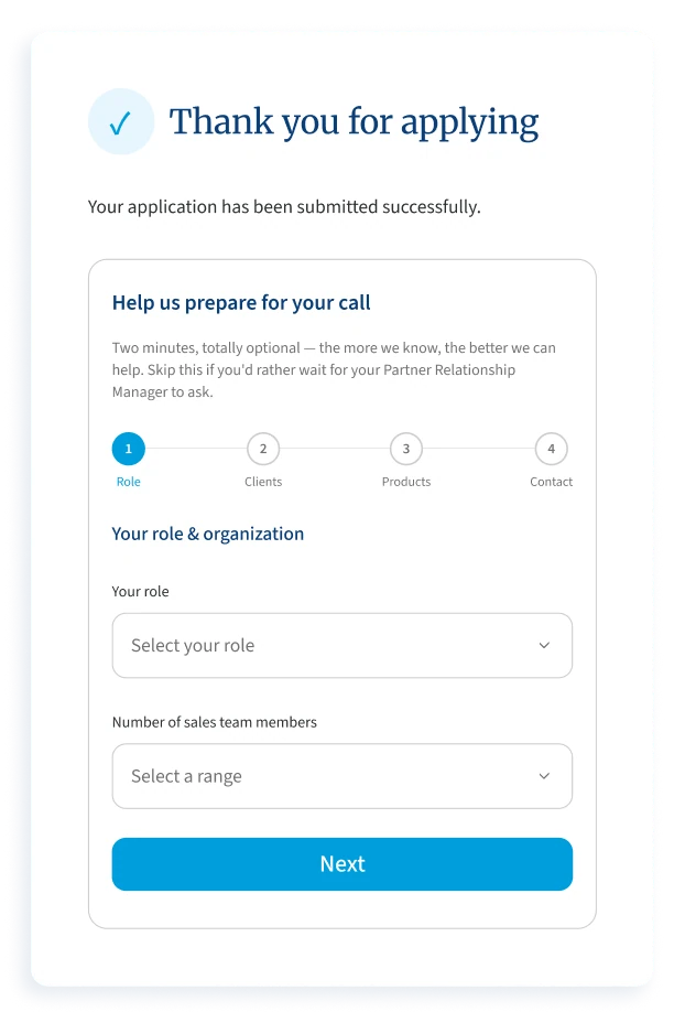
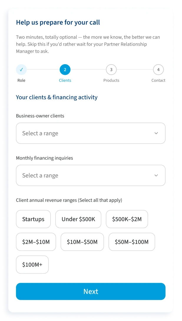
03 · 2026
From a long form to a hub of their own.
Watch
A year after launch, about 64% of visitors were on phones and three in four never scrolled past the hero. I worked through the Hotjar heatmaps and recordings, using AI to help synthesise them: six or seven apply buttons on every page, rage clicks on the amount slider, 232 errors on Apply Now, and applications started but not finished.
Before redesigning, I used AI to map the client and partner journeys and play out the scenarios around them: an owner without documents to hand, one who isn’t eligible yet, one who would rather talk to someone.
Nearly every section carried its own call to action on the mobile loan pages: button fatigue, not urgency.
Hotjar scroll depth on Apply Now, mobile, over three months: a drop-off signal, not a viewport spec.
Session recordings showed people overshooting the step-one loan-amount slider again and again.
Before
Rarely have a Social Security number, business finances and documents to hand on a first visit.
Needs all of it to fund a business, and needs to know early who meets its minimum requirements.
After
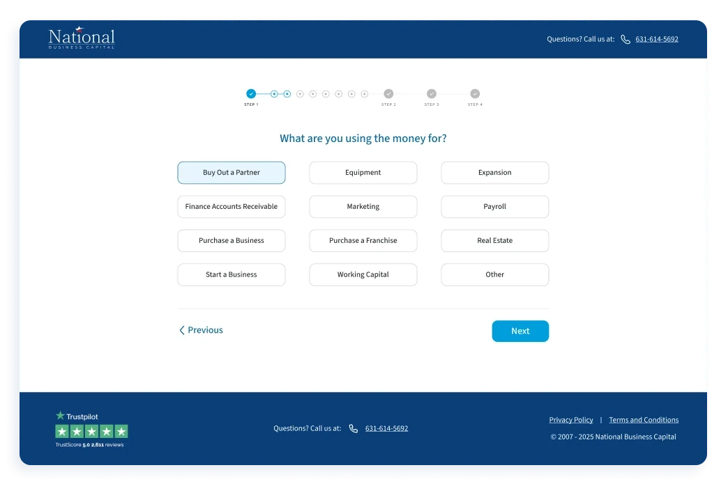
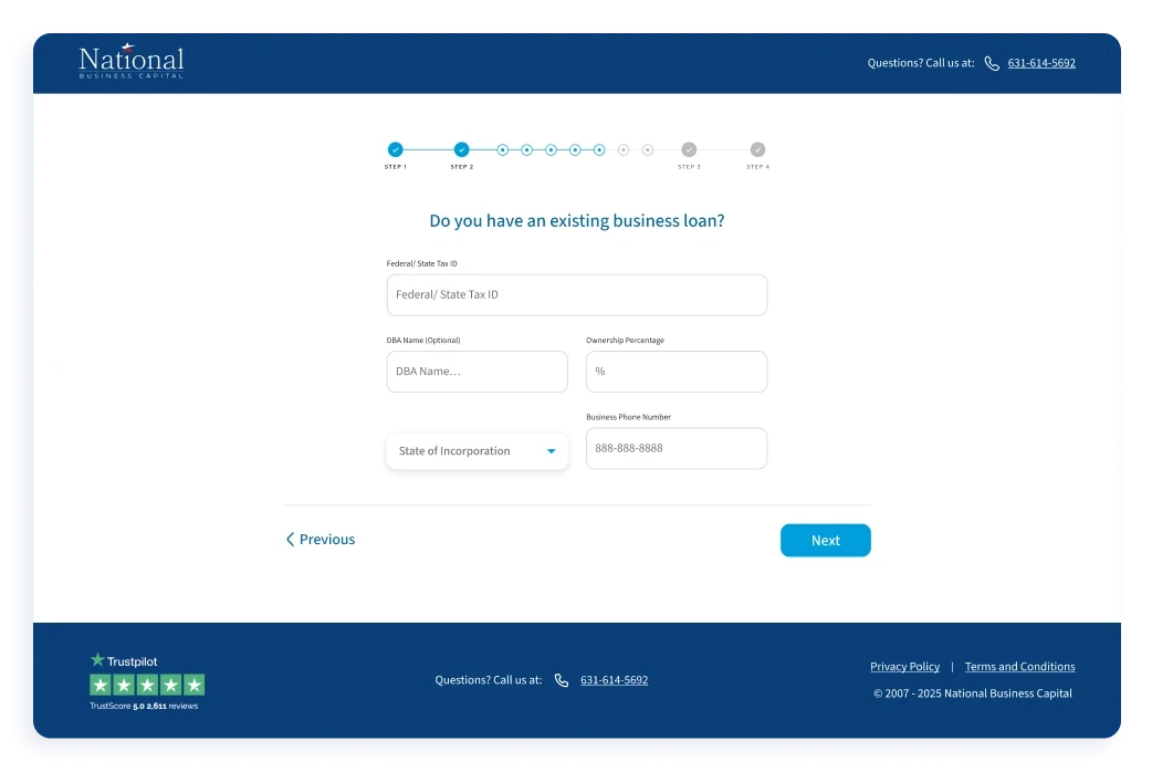
Owners pre-qualify in three steps: how much they need, the business, and how to reach them. They get an answer straight away: pre-qualified, under review or not eligible yet. Then they finish the rest alone, or on a call with a funding specialist.
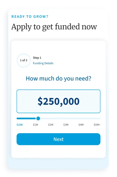
01 · How much
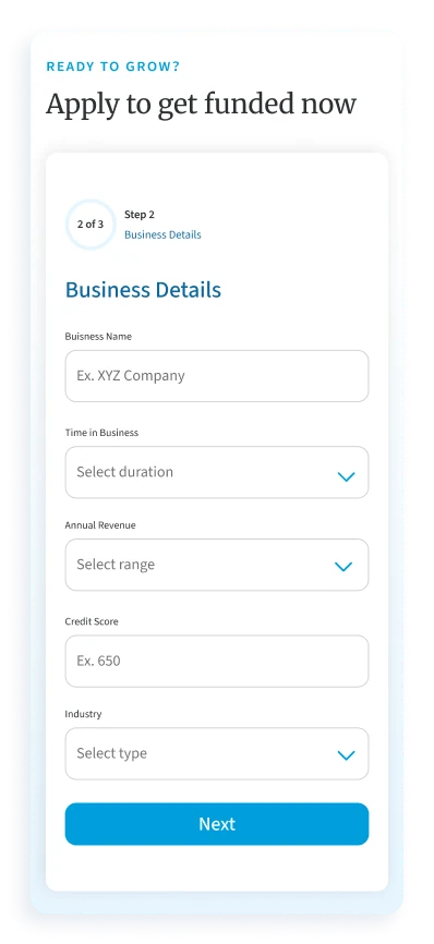
02 · The business
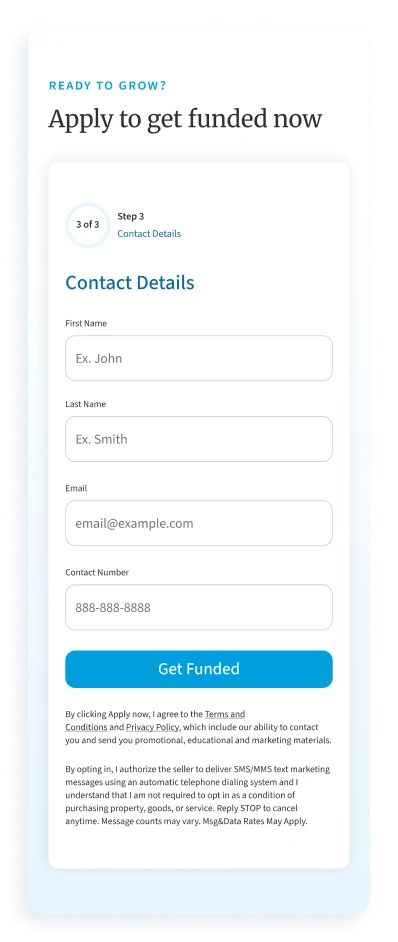
03 · Contact
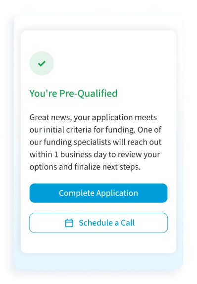
04 · An answer
Make
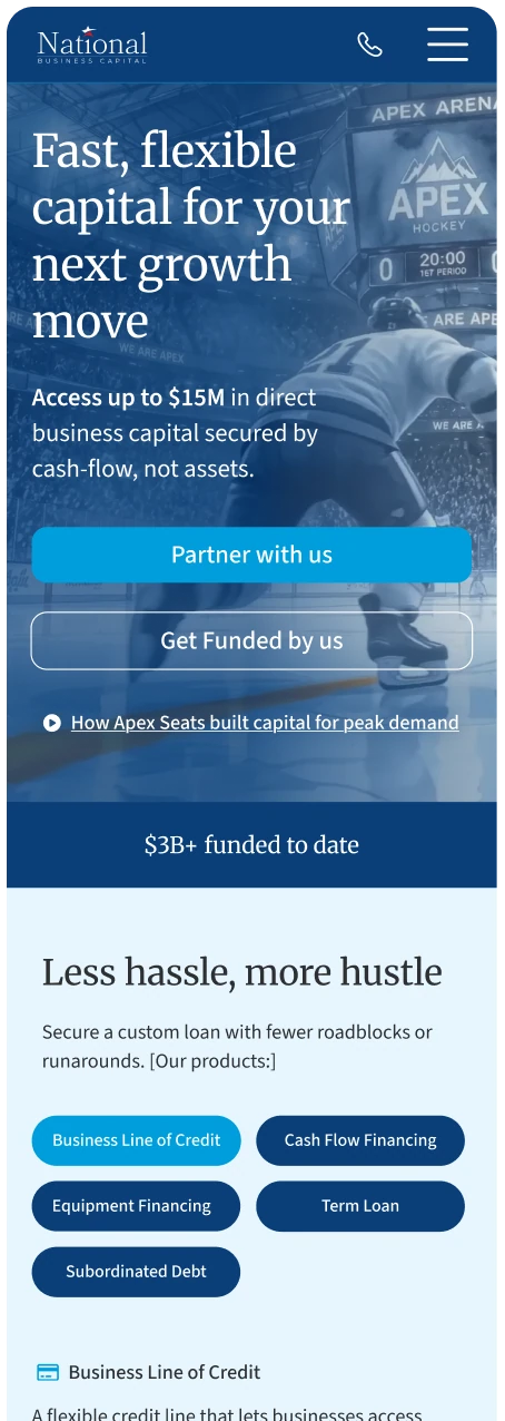
Before V2, “Get funded now” dropped a business owner straight into a long, multi-step application. V2 gives them a hub of their own first. It introduces National’s products, explains how funding works, and answers the questions an owner arrives with: who is this, what can I get, and how will it help my business? Trust signals sit alongside. When an owner decides this is the place for them, they apply from the same page.
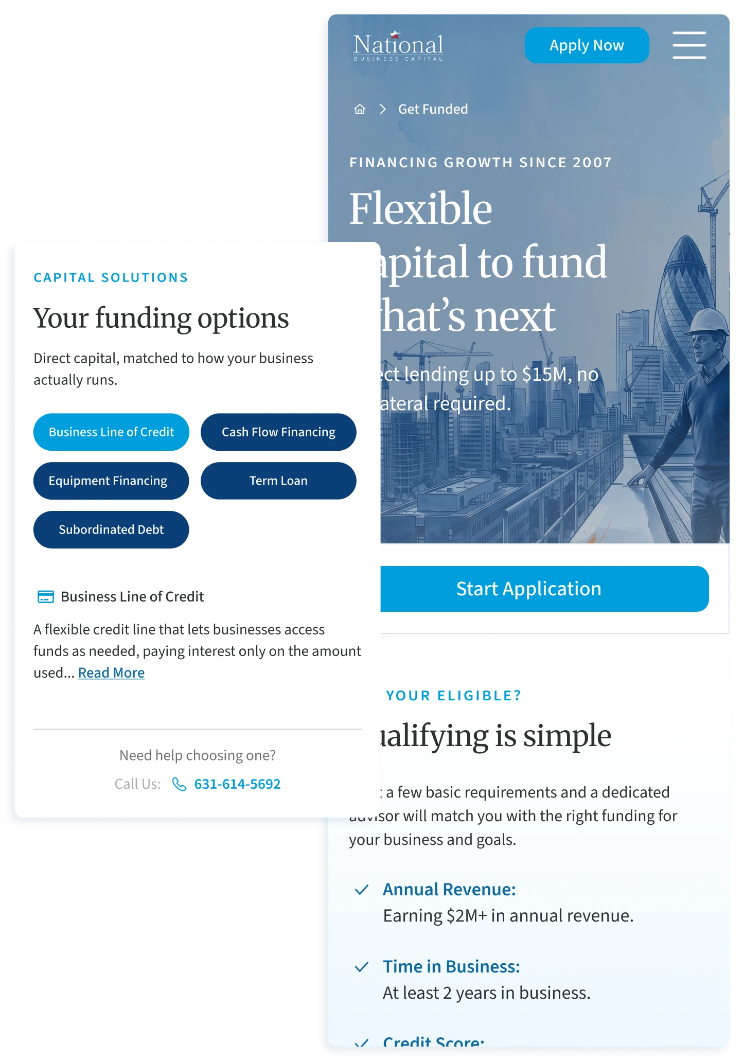
Nearly every section carried its own call to action on the mobile loan pages: button fatigue, not urgency.
Hotjar scroll depth on Apply Now, mobile, over three months: a drop-off signal, not a viewport spec.
Session recordings showed people overshooting the step-one loan-amount slider again and again.
01 · How much
02 · The business
03 · Contact
04 · An answer
One principle, the essentials first. Partners are asked for more after they submit; owners get an answer before they’re asked for more.
04 · 2025 – 2026
Proof, not testimonials.
Study
Every lender says it helps businesses grow; Growth Stories set out to show it. I studied how Stripe, Salesforce, Fin and Patagonia tell customer stories, then took three ways of grouping ours through wireframes and UI: by category, by client and by point of view. Owners look for businesses like theirs, so categories won, and leadership approved the route as presented.
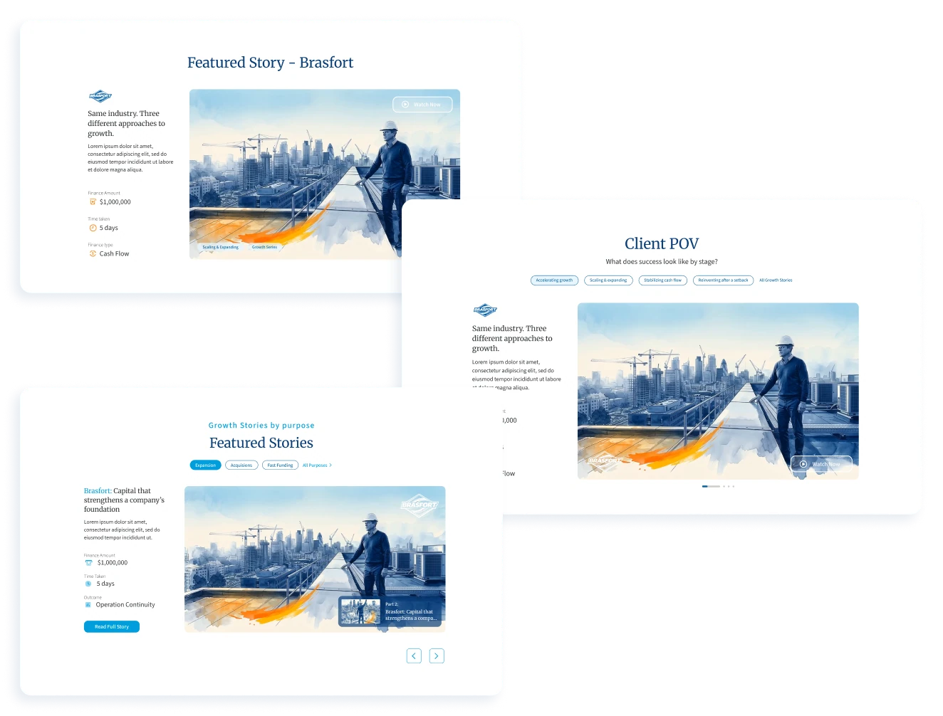
Decide
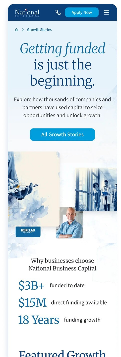
The categories became filters, refined over several rounds to the four owners reach for: industry, funding volume, use of funds and financing type. Clients funded more than once get a series.
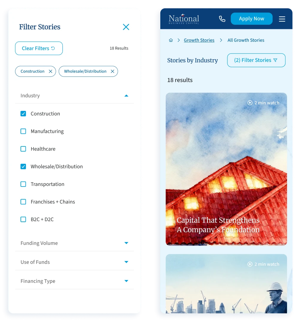
Make
Every story carries the same watercolour look, the Creative Director’s vision. I helped carry it into film with AI: storyboards and sketches became illustrations in Freepik and Weave, and AI interpolation built the frames between them. I worked on three films, Brasfort, Third Coast Motors and First Harvest; the motion designer refined the people and the light, and led production.
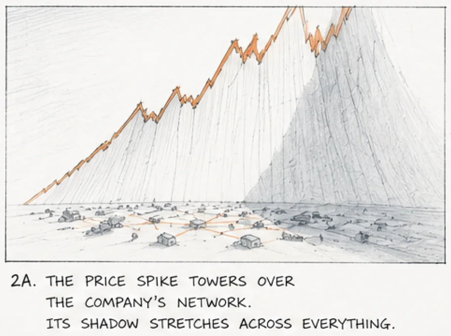




Watch
After launch, the dev team and I tracked the stories with Hotjar and Google Analytics, and I went through the recordings myself. People read the stories, but on a phone each one was a wall of text. In V2 I added jump-to-section navigation, removed a block left behind without its buttons, and fixed key figures set white on white.



Outcome
Next Wave Coffee, promoted on paid social, became the most-visited page on the site, with an average of 4 min 25 s spent on it.
Carried forward →
Growth Stories showed what National had done. Capital Insights would explain how it thinks.
05 · 2026
Complex content, a simple way in.
Decide
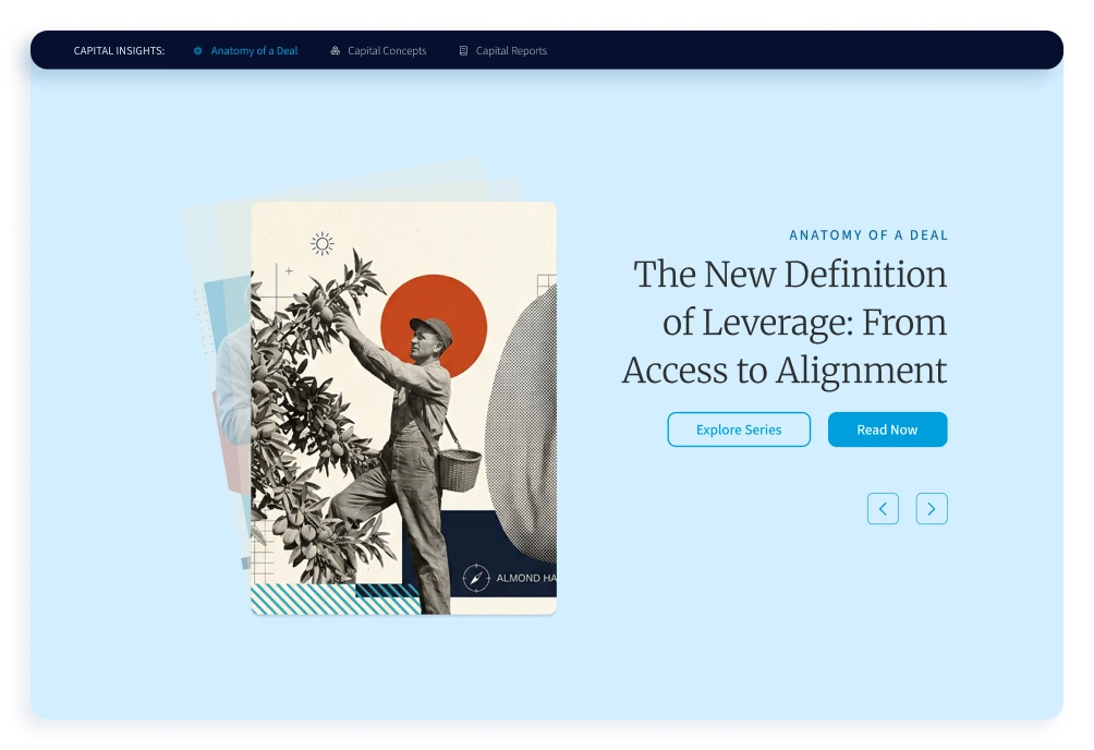
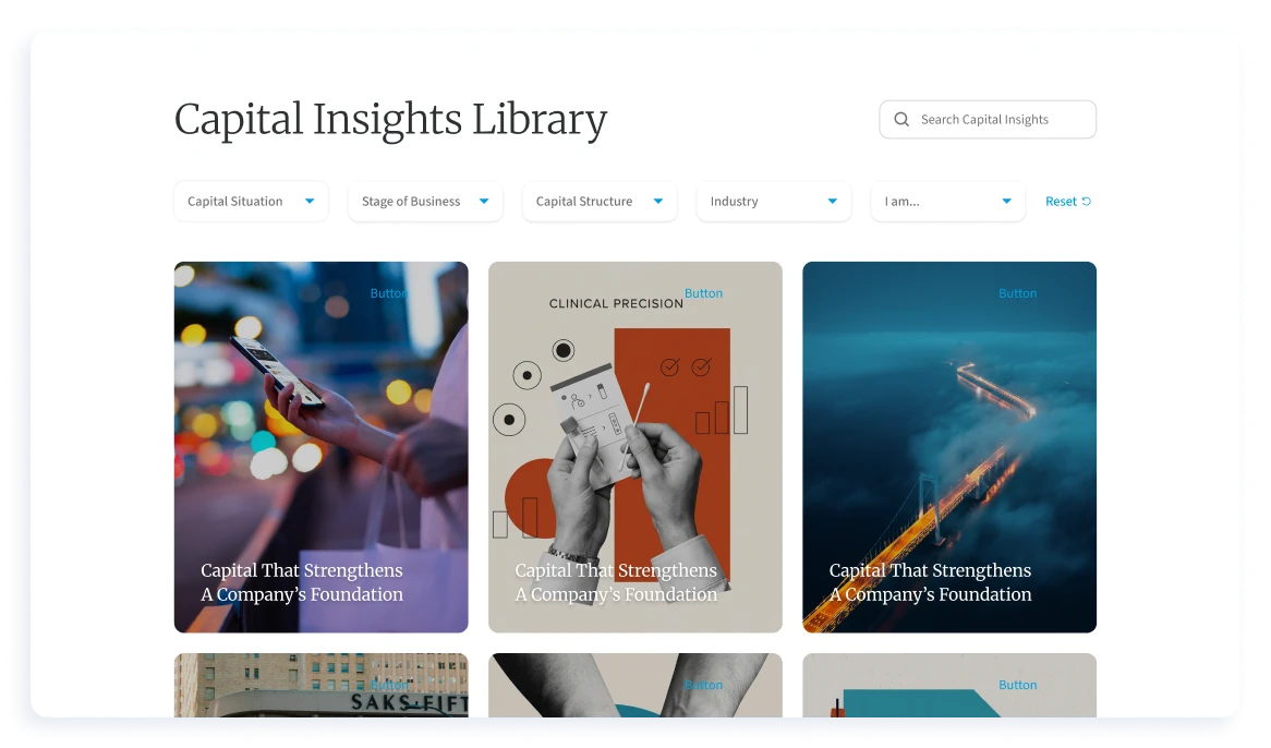
Capital Insights explains deal structure and lending trends to business owners, private-equity firms and advisors. Its content came in many overlapping types. I simplified how readers find it: three series, one bar between them, a hub that opens with the latest release, and a library that filters by capital situation, stage, structure and industry.
Make
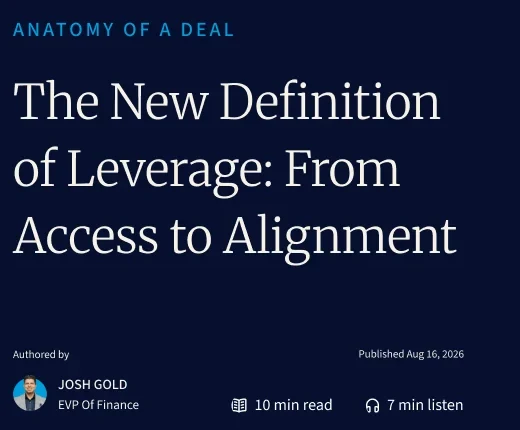
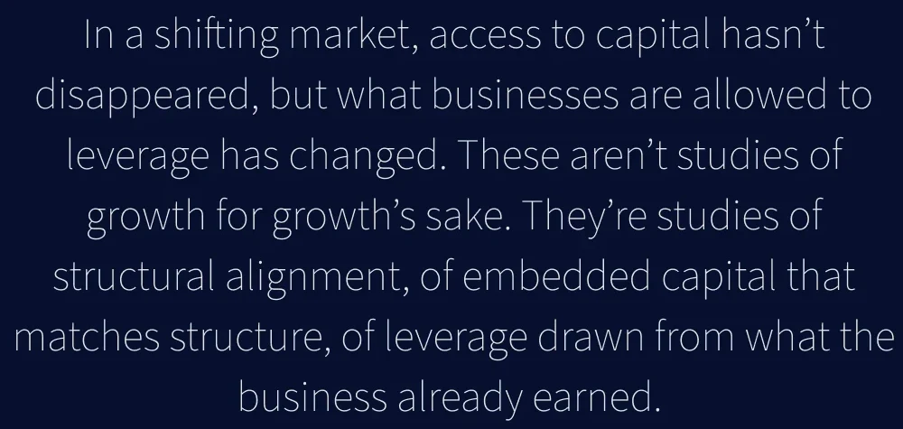
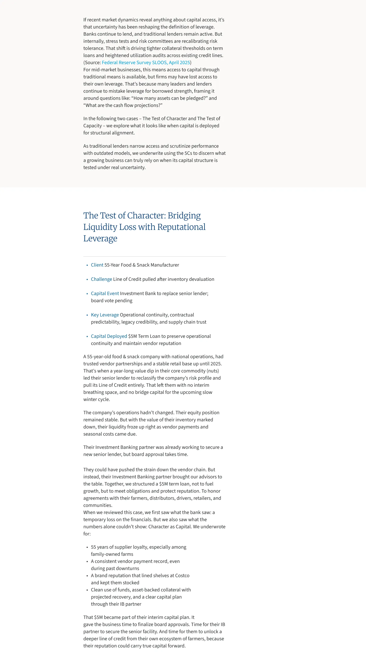
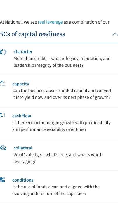
Leadership’s first review was mixed: the articles asked a lot of readers before giving anything back. I redesigned the long-form article around how people read. An opener sets the scene, with reading and listening time up front. A chapter index stays in view, so readers know where they are and can jump ahead, and each article ends with more from its series.
I prototyped the scroll with AI so it could be felt, not described, then took it to engineering with requirements and a test plan, and checked it through release.




Outcome
Capital Insights launched in 2026 with three series, one navigation and a library.
Summary
The website and its three hubs launched, and in 2026 the whole site won the WebAward for Best Financial Services Website. I began National’s first design system, which the site and hubs were built on; it was still being extended when I left. V2, with the Client Hub and both application redesigns, was designed and delivered, and is in production.
Accessibility was built in from the first rules: the site was designed to WCAG AA, with contrast, labels, touch targets and focus order specified for engineering.
AI ran through the work: synthesising research, mapping journeys and scenarios, image and motion for the films, and prototyping.
From the WebAward judges
“The site makes complex financing information easy to understand.”
“NationalBusinessCapital.com does a strong job of making business financing feel fast, credible, and growth-focused.”